Ever finished a Pomodoro sprint and thought, “What just happened?” You’re not alone. That fleeting sense of accomplishment can turn into a mystery if you don’t capture the numbers behind it.
In the next few minutes, I’ll walk you through how to analyze Pomodoro session data so you can spot patterns, fix productivity leaks, and actually see progress—not just a vague feeling of “busy.” Think about a student cramming for finals, a remote worker juggling meetings, or a freelancer switching between client projects. All of them generate the same kind of data: start times, break lengths, tasks tackled, and interruptions.
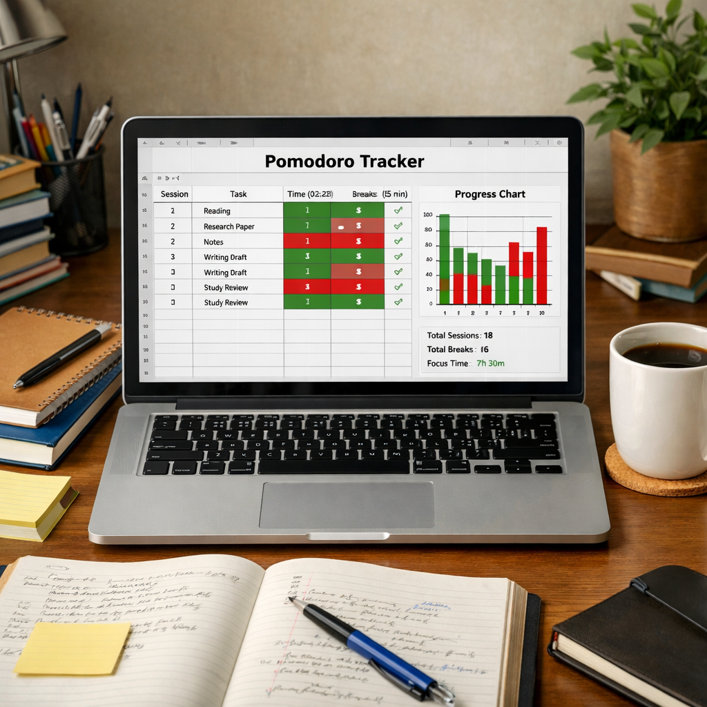
First, pull the raw session log. Most Pomodoro tools, including Focus Keeper, export a CSV with columns for date, duration, task name, and whether you marked the session as successful. Open it in a spreadsheet or, if you’re comfy with a bit of code, load it into Python or R. Look for three key metrics:
- Focus Ratio – total focused minutes divided by total time (including breaks). Aim for 70‑80%.
- Task Completion Rate – how many Pomodoros actually finish a task versus get abandoned.
- Interruption Frequency – count of “pause” flags or manual stop events.
Next, visualize the trends. A simple line chart of daily focus ratio over a month reveals whether you’re improving or hitting a plateau. Spotting a dip after a particular meeting time can tell a remote worker, “Hey, those 2 pm calls are killing your flow.”
Here’s a real‑world example: Maya, a freelance graphic designer, noticed her focus ratio dropped from 78% to 62% whenever she worked on client revisions after lunch. By shifting those revisions to the morning Pomodoro block, she bumped her ratio back up and shaved two hours off her weekly workload.
Now, let’s make this actionable. Grab your exported data and follow these three steps:
- Filter out any sessions marked “break” – you only want the focused work periods.
- Calculate the three metrics above using spreadsheet formulas (e.g., =SUMIF(range,criteria)/SUM(range)).
- Create a weekly dashboard: a bar for task completion, a line for focus ratio, and a scatter for interruptions.
When you start seeing the numbers, you’ll know exactly where to tweak your schedule. And if you ever wonder how to dig deeper into what those numbers mean, check out What is pomodoro timer widget? – Focuskeeper Glossary for a quick guide on turning session logs into actionable insights.
TL;DR
Analyzing your Pomodoro session data lets you spot focus spikes, task completion patterns, and interruption hotspots, turning raw timestamps into clear productivity insights.
With a quick spreadsheet or simple formulas, you can tweak your schedule, boost focus ratios, and reclaim wasted minutes, freeing up precious time for you every week.
Step 1: Collect Pomodoro Session Data
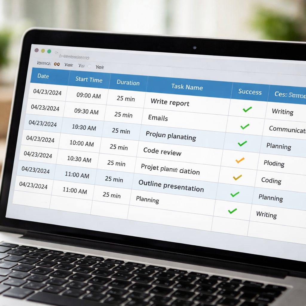
Okay, you’ve just wrapped a Pomodoro sprint and you’re wondering, “What did I actually do?” That moment of curiosity is the perfect launchpad for data collection. First thing’s first – you need a clean, reliable log of every session. If you’ve been using Focus Keeper, you already have a CSV export waiting in your downloads folder. If not, most timer apps let you copy‑paste a simple table with columns for date, start time, duration, task name, and a success flag.
Choose your capture method
There are three ways to get that data into a workable format:
- Export a CSV directly from the app – quick, no‑code.
- Sync with a Google Sheet using Zapier or Make – great for real‑time updates.
- Save a plain‑text log and import it into Excel or LibreOffice – old‑school but solid.
Pick the one that feels least frictiony for you. The goal is to avoid manual typing, because that’s where the data‑entry fatigue creeps in.
Standardise your columns
Open the file and make sure you have these headings, exactly as they appear:
- Date – yyyy‑mm‑dd format works everywhere.
- Start Time – 24‑hour clock keeps AM/PM confusion at bay.
- Duration – minutes per Pomodoro (usually 25).
- Task Name – a brief label, like “Write intro” or “Code module”.
- Success – a binary flag (yes/no) indicating whether you completed the interval.
If any column is missing, add it manually – a quick =IF() formula can turn a free‑text note into a yes/no flag.
Clean out the noise
Before you dive into analysis, strip out anything that isn’t a focused work block. That means deleting rows marked as “break”, “pause”, or any manual stop entries. You only want the pure Pomodoro slices, because those are the data points that reflect your actual productivity.
Tip: In Excel, use the filter dropdown on the Task Name column and uncheck anything that contains the word “break”. One‑click and you’re left with a tidy set of work sessions.
Tag tasks for deeper insight
If you haven’t already, start categorising tasks by type – study, client work, admin, creative, etc. Add a new column called Category and assign a short label. This extra layer lets you later see which kinds of work give you the highest focus ratio.
Don’t worry if you’re retrofitting old data; you can batch‑edit using Find & Replace or a simple VLOOKUP table that maps task keywords to categories.
Now that your spreadsheet is lean, labelled, and ready, you’ve built the foundation for any analysis you’ll run later.
Need a visual cue of what a clean data sheet looks like? Check out the quick walkthrough below.
Notice how the video walks through the export, column alignment, and basic filtering steps. Replicate that flow in your own file, and you’ll save hours down the line.
Once the data is tidy, you’re ready for the next step: calculating focus ratio, task completion, and interruption frequency. But before that, let’s give the sheet a quick visual sanity check.
Step 2: Clean and Organize Your Data
Now that you’ve got a raw CSV, the next thing you need to do is turn that mess into something your brain can actually read. Think of it like sorting laundry before you fold – you don’t want a sock stuck in a shirt when you’re trying to measure productivity.
Trim the noise
First, delete any rows that represent breaks, pauses, or manually stopped timers. Those entries are useful for a different kind of analysis, but for learning how to analyze pomodoro session data you only care about focused work periods.
Tip: In Google Sheets you can filter the “Session Type” column for “Work” and then copy‑paste the visible rows into a new sheet. In Excel, the same thing works with the auto‑filter dropdown.
Standardise time values
Most exports give you a time stamp like 09:15:00. Convert that into total minutes so every row speaks the same language. A quick formula does the trick: =HOUR(B2)*60+MINUTE(B2)+SECOND(B2)/60. Drag it down and you’ll end up with a clean “Duration (min)” column.
If you prefer a one‑off approach, copy the column, paste‑values, and then replace the original with the calculated numbers. It feels a bit manual, but it guarantees you know exactly what’s happening under the hood.
Add context columns
Now sprinkle in a few extra fields that will make later analysis richer. For students, a “Study Mode” column (lecture, reading, problem‑solving) helps you see which activity yields the highest focus ratio. Remote workers can add a “Meeting Overlap” flag to spot sessions that start right after a video call.
Freelancers love a “Client” column – you’ll soon be able to ask, “Which client drains my focus?” Busy professionals might add a “Time‑Block” tag (morning, afternoon, evening) to compare energy levels across the day.
Check for duplicates and blanks
Scroll to the bottom of the sheet and look for rows that look identical – same date, same start time, same duration. Those are often double‑click exports or accidental saves. Delete them, or keep the one with the most complete data.
Blank cells are silent troublemakers. If a duration cell is empty, you can either delete the whole row or fill it with an average based on that day’s other sessions. The key is to decide early and be consistent.
Normalize task naming
People love to rename tasks on the fly (“Write report”, “Report Draft”, “Report v2”). Before you crunch numbers, run a quick find‑and‑replace to collapse those variants into a single label. A consistent “Task Category” column makes the later metric Task Completion Rate far more trustworthy.
Even a simple spreadsheet trick helps: create a pivot table that lists every unique task name and its frequency. Spot the oddball entries and rename them in bulk.
Version your cleaned file
Save the tidy version with a clear name, like Pomodoro‑Data‑Clean‑2026‑04.csv. Keep the original untouched – you’ll thank yourself when you need to audit a change or compare before‑and‑after cleaning effects.
Pro tip: store both files in a cloud folder that auto‑syncs (Google Drive, OneDrive). That way you always have a backup and you can roll back if something goes sideways.
Quick sanity check before you move on
Take a moment to glance at the first ten rows. Do the dates line up with your calendar? Are the durations realistic (most Pomodoros hover around 25 minutes)? If anything feels off, pause and fix it now – catching it later will skew all your metrics.
Once the spreadsheet looks tidy, you’re ready to start calculating focus ratios, interruption frequencies, and whatever other insights you need. In our experience, the cleaner the data, the clearer the story you’ll be able to tell yourself about where your attention really lives.
So, grab that CSV, give it a good spring‑clean, and let the numbers start speaking for you.
Step 3: Visualize Key Metrics
Now that your data is tidy, it’s time to let the numbers talk. A picture is worth a thousand rows of CSV, especially when you’re trying to spot where your focus spikes or dips. Visualizing the key metrics turns raw minutes into a story you can actually act on.
Pick the right chart for each metric
Think of each metric as a character in a short film. The focus ratio needs a line chart – it shows change over time, so you can see whether you’re climbing toward that 75 % sweet spot or slipping after that 2 pm Zoom call. Task completion rate shines as a bar chart; each bar can represent a day or a project, making it easy to compare which client or subject is draining your energy.
Interruption frequency is a bit more chaotic, so a scatter plot works well. Plot each session’s interruption count against its duration and you’ll instantly notice outliers – maybe a 45‑minute sprint that got hit with three alerts. If you love a bird’s‑eye view, a heat‑map of hour‑by‑day can reveal the times you’re naturally most productive.
Build the charts in Google Sheets or Excel
Step 1: Highlight the columns you want to chart – for a focus‑ratio line, select the date column and the calculated ratio column.
Step 2: Insert → Chart (Sheets) or Insert → Recommended Charts (Excel). Choose “Line” and watch the curve appear.
Step 3: Tweak the axes. Set the y‑axis to a fixed 0‑100 % range so spikes don’t get lost in a stretched scale. Add a thin trendline to see the overall direction at a glance.
Step 4: For a bar chart, repeat the process with the task‑completion column. Group bars by week or by client using the “Series” options – this makes the visual bite‑size.
Step 5: Scatter plots need two numeric series. Use “Duration (min)” on the x‑axis and “Interruptions” on the y‑axis. Turn on data labels if you want to spot a specific session later.
Interpret what you see
Once the charts are in place, ask yourself simple questions. Does the line chart show a steady rise after you moved “client revisions” to the morning? If the bar chart shows a particular project consistently under 50 % completion, maybe that task needs breaking into smaller Pomodoros.
Look for clusters in the scatter plot – a handful of points with high interruptions could indicate a noisy environment (notifications, chats). The heat‑map might reveal that your “afternoon slump” isn’t a myth but a real dip around 3‑4 pm.
When you spot a pattern, write a quick note right on the sheet (Insert → Note). Those sticky‑note style reminders become your action items: “mute Slack at 2 pm,” “schedule deep‑work mornings for client X,” or “add a 5‑minute buffer after meetings.”
Quick reference table
| Chart Type | Metric Visualized | Quick Tip |
|---|---|---|
| Line Chart | Focus Ratio over time | Fix y‑axis 0‑100 % to keep trends comparable |
| Bar Chart | Task Completion Rate (daily or per client) | Group bars by week to smooth out daily noise |
| Scatter Plot | Interruption Frequency vs. Session Length | Enable data labels for sessions that look extreme |
Take a few minutes now to build at least one of these visuals. When the chart is live, you’ll instantly know where to tweak your Pomodoro schedule. Platforms like Focus Keeper make the export part painless, and the visual step is where the real insight happens.
Bottom line: visualizing key metrics turns a spreadsheet of numbers into a clear, actionable dashboard. That’s the missing piece that lets you move from “I think I’m productive” to “Here’s exactly how I’m improving, and where I need to double‑down.” Let the charts guide your next Pomodoro sprint, and watch your focus ratio climb.
Step 4: Deep Dive Analysis Techniques
Alright, the charts are up and you can see where the dips are. Now it’s time to move from “oh, that’s weird” to “here’s why that happened.” This is the part where you start teasing out the story hidden in every Pomodoro.
Slice the data by context
First, add a “Context” column if you haven’t already – think “Morning vs Afternoon,” “Client A vs Client B,” or “Study vs Review.” A quick pivot table will instantly show you focus ratio broken down by each segment. You might discover that remote workers see a 10 % boost when they block out the first two hours after a stand‑up call, or that students hit a 15 % slump right after lunch.
Does that line up with your gut feeling? If it does, you’ve just turned a vague impression into data you can act on.
Spot correlations – interruptions vs. focus
Grab the “Interruptions” column and run a simple correlation formula: =CORREL(Interruptions, Focus_Ratio). A negative number means more alerts are dragging your ratio down. For freelancers, this often points to “client chat pings” as the culprit. For busy professionals, it might be calendar reminders.
Try it out: if the correlation is –0.6, you know each extra interruption is shaving off a decent chunk of focus. That’s a solid reason to mute Slack for a set window.
Identify outliers with conditional formatting
Highlight any session where focus ratio falls below 60 % or where interruptions exceed three. In Google Sheets, use Format → Conditional formatting, set the rule, and watch the red cells pop up. Those red rows are your “quick‑win” targets – the sessions that need a tweak right now.
Ever notice a single 45‑minute sprint with five alerts? That’s a classic outlier screaming for a change in environment.
Apply moving averages for trend smoothing
Single‑day spikes can be noisy. Create a 7‑day moving average of focus ratio: =AVERAGE(OFFSET(Current_Cell,‑6,0,7,1)). Plot that line on top of your original chart. Suddenly you can tell if a new habit (like a 10‑minute meditation break) is nudging the average upward or just a fluke.
If the smoothed line climbs steadily after you started using Focus Keeper’s “Do Not Disturb” mode, you have hard evidence that the feature is paying off.
Cross‑compare task types
Use a stacked bar chart to compare “Task Category” against “Task Completion Rate.” You may see that “Creative Design” sessions finish only 45 % of the time, while “Email Drafting” breezes through at 85 %. That tells you where to break work into smaller Pomodoros or add a buffer.
Does that feel familiar? Many freelancers tell us the same – big creative chunks need more frequent breaks.
Build a focus heat‑map
Take the hour of day (0‑23) and day of week, then calculate the average focus ratio for each cell. In Excel, a PivotTable → Values → Average, then Conditional Formatting → Color Scale gives you a heat‑map in minutes. The bright squares show your power hours; the dull ones flag the “afternoon slump.”
Once you see the pattern, you can schedule deep‑work blocks right where the heat is hottest.
Turn insights into action items
For every pattern you uncover, write a one‑sentence action note directly in the sheet – “Turn off email notifications after 2 pm,” “Batch client revisions to mornings,” or “Add a 5‑minute stretch after every 3 Pomodoros.” Keep the note next to the data that triggered it; that way the sheet becomes a living to‑do list.
And remember, the goal isn’t a perfect dashboard; it’s a practical map that tells you exactly what to tweak tomorrow.
By drilling down with these techniques, you move from “I have numbers” to “I have a roadmap.” Your Pomodoro practice becomes a science you control, not a mystery you tolerate.
Step 5: Interpret Results and Optimize Pomodoro Use
Alright, you’ve built the charts, you’ve spotted the highs and lows – now it’s time to actually read what those numbers are shouting at you.
Read the numbers, don’t panic
First glance at your focus‑ratio line. Is it hovering around 70 % most days, then dipping to the 50 % zone after every 2 pm meeting? That dip isn’t a flaw in the method; it’s a clue that something in your environment is stealing attention.
Ask yourself: “What’s different right before that dip?” Maybe a Slack channel blows up, maybe you’re juggling a client call. Jot that observation next to the data point – a quick note in the same sheet works better than a separate notebook.
Turn patterns into experiments
Now that you have a pattern, treat it like a mini‑experiment. If interruptions correlate with a –0.5 correlation coefficient, try a 30‑minute “do‑not‑disturb” block during your peak hour. Record the change in the next week’s chart. The goal isn’t perfection; it’s a cycle of small tweaks that keep the system moving forward.
Students, for example, often see a focus‑ratio slump right after lunch. A simple experiment: shift the next‑day study Pomodoros to 10‑minute “review” slots before lunch, then resume deep work after the break. Compare the two weeks – the numbers will tell you if the shift helped.
Use moving averages to smooth noise
Single‑day spikes can feel scary, especially when you’re busy. Add a 7‑day moving average column (you can use =AVERAGE(OFFSET(…))) and plot that line on top of your original chart. That smoothed line shows the real trend, stripping away the occasional glitch caused by a surprise Zoom call.
If the moving average is climbing steadily after you introduced a 5‑minute stretch after every three Pomodoros, you’ve got evidence that the habit is paying off.
Prioritise action items, not dashboards
It’s easy to get lost in pretty charts. The real power lies in the one‑sentence action notes you attach to each insight. “Mute Slack at 2 pm,” “Batch client feedback to mornings,” or “Add a 2‑minute breathing break before creative tasks” – keep those notes right beside the data that inspired them.
When you open the sheet tomorrow, those notes become a to‑do list that’s already backed by evidence. That’s how you move from “I have numbers” to “I have a roadmap.”
Iterate weekly, not monthly
Productivity isn’t a set‑it‑and‑forget‑it garden; it needs regular watering. Schedule a 15‑minute review every Friday: glance at the week’s focus ratios, spot any new outliers, and add a fresh action note. If a new client project shows a sudden dip, you’ll catch it before it becomes a habit.
Remote workers often find that a new recurring stand‑up pushes their deep‑work window later. A quick weekly tweak – moving the stand‑up 15 minutes earlier – can reclaim that lost focus time.
Leverage your tool’s built‑in reminders
Focus Keeper lets you set custom alerts for specific Pomodoro counts. Use those alerts to remind yourself to check the dashboard or to trigger a short stretch. The reminder becomes a built‑in checkpoint that nudges you to act on the data you’ve already collected.
Remember, the whole point of learning how to analyze pomodoro session data is to give yourself a feedback loop that feels almost automatic. The more you embed the review into your routine, the less mental energy you spend deciding what to tweak.
Final checklist for step 5
- Look at focus‑ratio trends and note any consistent dips.
- Calculate correlation between interruptions and focus; act on the strongest negative links.
- Add a 7‑day moving average to see true direction.
- Write one‑sentence action items directly in the sheet.
- Schedule a weekly 15‑minute review session.
- Set Focus Keeper alerts to prompt checks and micro‑breaks.
By treating your data as a living roadmap rather than a static report, you’ll keep fine‑tuning your Pomodoro practice without the overwhelm. That’s the sweet spot where analysis meets action, and where your productivity finally feels both measurable and manageable.
Step 6: Automate Reporting with Tools
Now that you’ve got clean data and a handful of charts, the next logical step is to stop manually pulling the same numbers every week. Imagine waking up, opening your dashboard, and seeing the latest focus‑ratio trend already plotted—no extra clicks required. That’s what automation feels like.
Why automate?
Because human brains love shortcuts. When a report pops up on its own, you’re far more likely to glance at it during a coffee break instead of postponing the review until next Friday. Remote workers juggling Zoom calls, a quick auto‑email with the week’s highlights can be the nudge they need to protect their deep‑work window.
Freelancers, too, benefit from a “report‑on‑demand” button that sends a summary to a client, showing how many Pomodoros were spent on each project. It turns raw numbers into a conversation starter without you having to draft the email yourself.
Pick a tool that talks to your spreadsheet
If you’re already comfortable in Google Sheets, the built‑in Apps Script can run a tiny function every Sunday night. Imagine a script that pulls the latest rows, calculates the 7‑day moving average, and emails a PDF snapshot to your inbox. The code is only a dozen lines, and you can copy‑paste it from the official Google documentation.
Excel fans can use Power Query combined with Power Automate. Set up a flow that triggers when a new CSV lands in OneDrive, refreshes the data model, and pushes the updated dashboard to a Teams channel. This way the whole team sees the same numbers at the same time.
Step‑by‑step: a simple Google‑Sheets automation
1. Open the sheet where you keep your Pomodoro log.
2. Click Extensions → Apps Script and paste a function that:
- Reads the last 30 rows.
- Computes focus‑ratio, interruption count, and task‑completion rate.
- Writes those summaries to a new “Weekly Summary” tab.
3. Save the script, then go to Triggers and create a time‑driven trigger for “Every Sunday at 7 pm.”
4. Add a line that formats the summary as a PDF and uses MailApp.sendEmail() to ship it to yourself or your stakeholder list.
Once you hit save, the whole process runs in the background. No more copy‑pasting formulas or hunting for the right date range.
Automation for busy professionals
For those who prefer a no‑code approach, services like Zapier or Make (formerly Integromat) can bridge your CSV export and a reporting template in Google Docs. The workflow looks like this:
- Trigger: New file added to a specific Google Drive folder (your daily export).
- Action: Parse the CSV, calculate the key metrics with a built‑in “Formatter” step.
- Action: Populate a pre‑made Google Docs template that reads like a mini‑report.
- Action: Send the finished doc as an attachment to a Slack channel or email.
The beauty is you don’t need to touch code at all—just point‑and‑click. And because the template lives in Docs, you can tweak the wording once and let the automation handle the numbers forever.
Does this sound too techy? Not really. Most of the setup takes under 30 minutes, and once it’s humming, you’ll spend those 15‑minute weekly review slots actually reviewing insights instead of building them.
Keep the loop alive
Automation isn’t a set‑and‑forget button; it’s a feedback loop. Schedule a monthly “automation audit” where you glance at the generated reports and ask, “Is the data still relevant? Do I need a new metric?” Add or remove columns in your source CSV, and the script will automatically adapt—as long as the column headers stay consistent.
And remember, the goal isn’t to replace thoughtful analysis—it’s to free up mental bandwidth so you can focus on the “why” instead of the “what.” When the numbers arrive on their own, you’re more likely to ask, “What pattern am I seeing this week?” and act on it immediately.
In a nutshell, automate the boring bits, keep the report human‑centric, and let the data work for you. That’s how you truly master how to analyze Pomodoro session data without drowning in spreadsheets.
Conclusion
We’ve come a long way from just ticking off Pomodoros to actually reading the story your data tells.
If you’ve followed the steps—collecting raw logs, cleaning them, visualising the key metrics, and even automating the weekly snapshot—you now have a living map of where your focus thrives and where it stalls.
So, what’s the next move?
Pick one insight that surprised you this week—maybe a dip after that 2 pm stand‑up or a spike when you batch creative work in the morning—and turn it into a tiny experiment. Change a single variable, run it for a few cycles, and watch the numbers shift.
Remember, the goal isn’t a perfect dashboard; it’s a habit loop that nudges you toward better decisions without draining mental energy.
Do you feel ready to let the data speak for you?
From students carving out study windows to remote teams protecting deep‑work blocks, the same principles apply: keep the metrics simple, review them regularly, and act on the patterns you see.
In short, treat your Pomodoro data like a compass—calibrate, check, and adjust. When you make that a routine, productivity becomes less about willpower and more about evidence‑based tweaks.
Ready to make the next tweak? Open your latest report, note the top action, and schedule a 15‑minute review for tomorrow. You’ve got the tools; now let the insights drive your next win.
FAQ
What’s the first step to analyze pomodoro session data?
Start by pulling a raw export from your Pomodoro timer – most apps let you download a CSV with date, start time, duration, task name and a success flag. Open it in Google Sheets or Excel and give each column a clear header. That clean sheet becomes the foundation for every chart, ratio or trend you’ll calculate later.
How do I calculate a focus‑ratio from my raw data?
Focus‑ratio is simply the amount of time you spent in successful Pomodoros divided by the total logged minutes for a day. In a spreadsheet add a column that flags “1” for completed sessions, sum the minutes for those rows, then divide by the sum of all minutes for the same day. Format the result as a percentage – you’ll instantly see which days hit your target and which need tweaking.
Which visualisations work best for spotting productivity patterns?
A line chart for daily focus‑ratio lets you see trends over weeks; bar charts are great for comparing task‑completion rates across projects; and a heat‑map of hour‑by‑day highlights your natural power‑hours. Build them with the chart wizard – just select the date column and the metric column, choose the appropriate type and lock the y‑axis to 0‑100 % for consistency.
What’s a quick way to spot interruptions that hurt my focus?
Add an “Interruptions” column and mark a “1” whenever a notification, chat or meeting breaks a Pomodoro. Then run a simple correlation formula, like =CORREL(Interruptions, Focus_Ratio). A negative result means more alerts are dragging your ratio down. Once you know the culprits, you can schedule a Do‑Not‑Disturb window or batch communication to protect deep‑work blocks.
How often should I review my Pomodoro analytics?
Set a recurring 15‑minute review – Friday afternoon works for most people because the week is winding down and you can plan tweaks for Monday. During that slot glance at the focus‑ratio line, note any outliers, and write a one‑sentence action item next to the data point. Keeping the review brief makes it a habit rather than a chore.
Can I automate the reporting so I don’t have to rebuild charts every week?
Yes. In Google Sheets you can use Apps Script to pull the newest rows, recalculate your key metrics and email a PDF snapshot on a Sunday night. Excel users can pair Power Query with Power Automate to refresh a dashboard and push it to Teams. Automation frees mental bandwidth so you can focus on interpreting the insights instead of recreating them.
What’s a common mistake people make when analyzing Pomodoro data?
People often look at a single day’s numbers and panic over a dip. The data is noisy – a surprise meeting or a personal call can skew one point. Instead, rely on moving averages (7‑day is a good start) and look for consistent patterns before deciding on a change. Remember, the goal is incremental tweaks, not perfection.