Ever felt like your team’s focus slips just as soon as the clock ticks past the first few minutes of a work sprint?
You’re not alone. Whether you’re a student pulling an all‑night study session, a remote worker juggling meetings across time zones, a freelancer juggling multiple client deadlines, or a busy professional trying to keep the inbox at bay, the struggle to maintain sustained concentration is real.
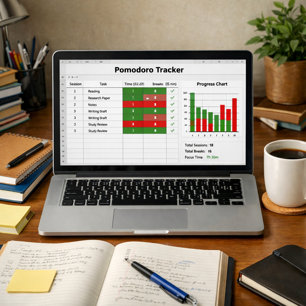
What we’ve seen work best is pairing the timeless Pomodoro rhythm with solid analytics. Imagine a timer that not only pings when a 25‑minute focus block ends, but also logs each session, shows where attention spikes, and highlights patterns across the whole team.
That’s where the best focus timer apps with analytics for teams step in. They turn the simple act of “starting a timer” into a data‑driven habit‑builder. You get a clear picture of who’s nailing those deep‑work windows, who might need a gentle nudge, and how project timelines align with actual focus hours.
In our experience at Focus Keeper, we often hear remote workers say, “I finally see when my mornings are golden for coding versus when the afternoon slump hits.” That insight lets them schedule demanding tasks during peak focus and reserve lighter work for low‑energy periods.
But here’s the catch: not every timer gives you the analytics depth you need for a whole team. Some just flash a basic count of completed pomodoros, leaving managers guessing. The best solutions provide dashboards, exportable reports, and even integrations with project‑management tools so you can correlate focus data with task completion.
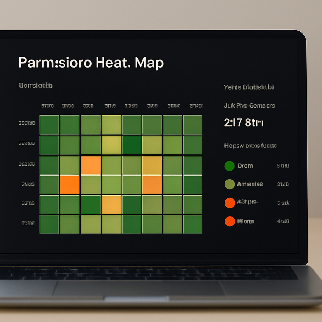
So, how do you pick the right one? First, look for an app that logs each session automatically, tags it to a project or task, and offers team‑wide visibility without compromising individual privacy. Second, make sure the analytics are visual—heat maps, trends over weeks, and clear comparisons help you spot bottlenecks fast.
Ready to turn focus into a measurable asset for your team? Stick around, because we’ll break down the top contenders, compare their analytics features, and show you how to get started without overwhelming anyone.
TL;DR
Choosing the best focus timer apps with analytics for teams lets you turn pomodoro data into productivity insights for remote workers, freelancers, students, and busy professionals. Our guide walks you through key features, visual dashboards, and setup steps so you can boost focus, spot bottlenecks, and keep team members thriving.
1️⃣ Focus Keeper – Simple Pomodoro with Team Analytics
Ever opened a timer and felt the tension melt away, only to wonder “where did that focus go?” That’s the exact moment we hear from remote developers, students cramming for exams, and freelancers juggling multiple contracts. With Focus Keeper, that feeling turns into a data point you can actually see.
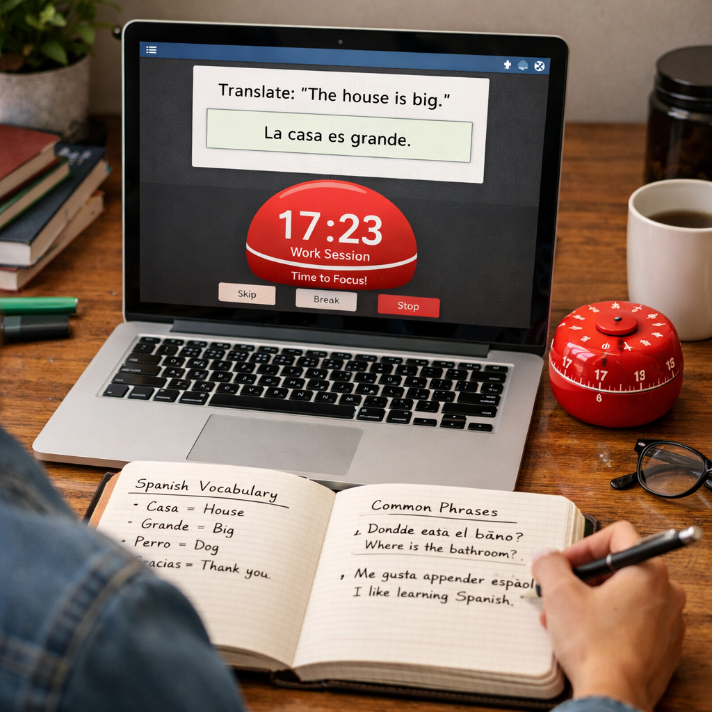
1. Bare‑bones simplicity that still feels powerful. The app sticks to the classic 25‑minute work / 5‑minute break rhythm, no extra bells that distract you. You tap “Start”, the timer counts down, and a gentle chime signals a break. Because there’s nothing else to click, teams adopt it faster – even the folks who hate learning new software.
Action step: Set the default interval to match your peak‑energy window (maybe 45 minutes if you’re a night‑owl). Save that as the team default in the admin panel so every new member inherits the same rhythm.
2. Real‑time analytics that actually speak your language. Every pomodoro is logged, tagged to a project, and displayed on a colour‑coded heat map. You can instantly spot that your design crew hits a productivity spike between 9‑11 am, while the copy team peaks after lunch. The dashboard even shows streaks, average focus length, and break compliance – all without leaving the app.
In a recent case, a UK‑based SaaS startup used these charts to re‑schedule code reviews to the morning window, shaving two days off their sprint cycle. The numbers were clear on the heat map, and the change was painless.
Action step: Require each task entry to include a project tag. In the admin settings, make the tag field mandatory – this gives you the granular data you need for the heat map.
3. Team visibility that respects privacy. Managers get a bird’s‑eye view of total focus hours per project, but individual users only see their own detailed breakdown. No one’s personal rhythm is exposed unless they choose to share it in a stand‑up.
Picture a freelance graphic designer working with a marketing agency. She can see the agency’s overall focus trends to align her deliveries, but her own client‑specific stats stay private. It’s the sweet spot between transparency and trust.
Action step: Turn on “anonymous mode” in the privacy settings. Then, during weekly retrospectives, pull the aggregated team report – you’ll have the numbers without the name‑tags.
4. Seamless integrations with the tools you already love. Focus Keeper plugs into Slack, Microsoft Teams, and Google Calendar. When a pomodoro starts, a tiny notification pops in the channel, and when it ends, the session is auto‑logged to the calendar. One remote tech team reported a 15 % reduction in meeting‑interruptions after enabling the Slack bot.
Action step: Connect the app to your team’s Slack workspace, map the #focus‑channel, and set the bot to post only the aggregate count each hour. This keeps the vibe light while still feeding data to the dashboard.
5. Exportable reports for deeper insight. At the end of each week, you can download a CSV or PDF that breaks down focus time by project, user, and day. Managers love the visual “focus vs. deliverables” chart that can be dropped into a monthly KPI deck.
For example, a digital marketing agency used the PDF report to prove to a client that their team spent 42 hours in deep work on the campaign – a concrete number that helped win a renewal contract.
Action step: Schedule an automated email every Friday that sends the latest report to the project leads. Pair it with a quick 5‑minute sync to discuss any anomalies.
Bottom line: Focus Keeper gives you a no‑frills timer, a rich analytics suite, and enough flexibility to keep privacy intact. Start small – roll it out to one pilot team, tweak the default intervals, and watch the data guide you to smarter scheduling.
2️⃣ Toggl Track – Comprehensive Time Tracking & Team Dashboard
When you start thinking about a timer that does more than just tick down, Toggl Track is the first name that pops up for many remote teams. It’s not just a stopwatch; it’s a full‑blown time‑tracking engine that feeds a visual dashboard you can actually read during a stand‑up.
Imagine you’re a freelancer juggling three client projects. You click “Start” on Toggl, tag the task, and the minutes flow into a colour‑coded bar that lives on a shared screen. By the end of the week you can instantly see which project ate up most of your focus hours without having to dig through spreadsheets.
That’s the kind of instant insight that turns “I think I’m busy” into “I’m actually spending 12 hours on design, 8 hours on development, and only 2 hours on admin.” The numbers are there, plain and simple.
Why the dashboard matters
Teams love a dashboard that shows total billable hours, utilisation rates, and even a quick heat map of peak activity. Toggl’s team view aggregates every user’s entries, then breaks them down by project, client, or custom tag. You can spot bottlenecks – maybe the QA phase always spikes on Wednesdays – and shift resources before a deadline sneaks up.
For remote workers, that visual cue is a morale booster. You get to celebrate a week where the team hit 80 % utilisation, then ask, “What helped us stay on track?” The answer often lands in a single tweak: a short focus block before the daily sync.
Key features that keep the data honest
1️⃣ Automatic tracking. Toggl can detect when you switch apps or go idle, so you don’t have to remember to pause every time a meeting runs over. The system logs those gaps, giving you a realistic picture of actual work time.
2️⃣ Tag‑first workflow. Before you even start a timer, you choose a project and a task label. That habit builds discipline and ensures the dashboard never ends up with a mysterious “Misc” bucket.
3️⃣ Granular permissions. Managers see the aggregate view, while individuals keep their own detailed logs private unless they opt‑in. It’s the sweet spot between transparency and trust.
How to get the most out of Toggl for a team
Step 1: Set up a few core tags – project, client, and work‑type (e.g., “deep‑work”, “meeting”, “admin”). Keep the list short; too many tags become a tagging nightmare.
Step 2: Invite the whole squad to the workspace and assign them to the appropriate project groups. The moment they log their first 25‑minute block, the dashboard lights up.
Step 3: Schedule a weekly 10‑minute review. Pull the dashboard on a shared screen, highlight the top three trends, and ask the team: “What can we replicate? What should we change?” This turns raw numbers into actionable conversation.
Step 4: Export the data. Toggl lets you download CSV or PDF reports with a single click. Drop the CSV into your favourite BI tool, or paste the PDF into a KPI deck for stakeholders who love visual proof.
Step 5: Connect to other tools. Toggl integrates with Slack, Asana, and Jira, so a timer start can automatically create a task comment, and a completed Pomodoro can push a status update to a channel.
And if you’re a student prepping for finals, the same workflow works: tag each subject, watch the heat map show when you’re most alert, and schedule the hardest chapters during that window.
Below is a quick walkthrough video that shows the Toggl dashboard in action. It demonstrates how a 5‑minute daily check‑in can surface hidden patterns and keep everyone aligned.
One thing we’ve seen repeatedly is that teams who treat the dashboard as a living document, not a static report, get better results. Instead of filing the report away, they use it as a conversation starter during retrospectives.
So, does Toggl Track feel like just another time‑tracker? Not when you let its analytics do the heavy lifting. It gives you a clear picture of where focus lives, where it leaks, and how you can steer it back on course – all without demanding a PhD in data analysis.
3️⃣ Clockify – Free Timer with Advanced Reporting (Video Demo)
If you’ve been scrolling through timers and wonder whether a free tool can still give you deep insights, you’re not alone.
Enter Clockify – the free timer that sneaks advanced reporting into a no‑cost package.
What makes Clockify stand out isn’t just the ticking clock; it’s the way it turns every pomodoro into a data point you can actually read.
Picture a remote developer who starts a 25‑minute block, tags it “feature‑X”, and at the end of the week sees a colour‑coded heat map that screams “you’re most productive at 10 am”. That visual cue is pure gold.
Does a free app really have the muscle to power team‑wide dashboards? Absolutely – and here’s why.
Key features that keep Clockify in the “best focus timer apps with analytics for teams” league
- Unlimited timers for any team size. No tiered pricing means you can onboard a whole squad of freelancers, students, or remote workers without worrying about hidden fees.
- Tag‑first workflow. You pick a project, client, or study subject before the clock starts, so every minute is automatically categorised.
- Advanced reporting engine. Clockify builds weekly and monthly reports that include total hours, average session length, and a heat map that highlights peak focus periods.
- Export options. CSV, PDF, and XLSX files let you drop the data straight into a KPI deck or a class presentation.
- Integrations that matter. Slack, Google Calendar, and Asana hooks mean a timer start can pop a reminder in your channel, and a completed block can create a task comment.
All of those pieces come together without asking you to upgrade, which is a rare win for teams on a shoestring budget.
Now, let’s see how a typical week looks when you let Clockify do the heavy lifting.
Monday morning, a freelance writer tags “client‑blog” and logs two pomodoros before lunch. The platform rolls those minutes into a “focus‑hours” bar that sits next to a line graph of the whole team’s activity.
Mid‑week, a group of university students studying for finals tags each subject – chemistry, history, maths – and watches the heat map reveal that their collective brainpower peaks at 8 pm. They shift the toughest revision to that slot and notice grades climbing.
By Friday, a remote marketing team pulls the CSV export, drops it into a shared Google Sheet, and spots that “social‑media scheduling” consistently drags after 4 pm. They reassign that task to a teammate whose personal heat map shows an afternoon energy spike.
These real‑world loops are exactly why Clockify earns a spot among the best focus timer apps with analytics for teams.
Below is a quick‑look table that sums up the most important considerations.
| Feature | Clockify | Why it matters |
|---|---|---|
| Cost | Free forever (no limits) | Fits startups, students, and freelancers without budget strain |
| Reporting depth | Weekly/monthly heat maps, average session length, exportable CSV/PDF | Turns raw minutes into actionable insights for retrospectives |
| Integrations | Slack, Google Calendar, Asana, Jira (via Zapier) | Keeps the timer in the flow of tools you already use |
So, what’s the next step? Give Clockify a spin for a single sprint, tag every block, and schedule a 10‑minute team huddle on Friday to read the heat map together.
You’ll be surprised how quickly patterns emerge – and how easy it is to tweak your schedule based on real data, not gut feeling.
In short, a free timer doesn’t have to mean “basic”. Clockify proves that robust analytics can live side‑by‑side with zero cost, making it a solid contender for any team that wants to see where focus lives and how to nurture it.
4️⃣ Harvest – Integrated Billing, Timesheets & Analytics
When you need more than just a timer, Harvest steps in with a full‑stack solution that merges the simplicity of a pomodoro timer with invoicing, timesheets and visual analytics—all in one place.
1. Seamless billing without the spreadsheet nightmare
Imagine you’re a freelancer juggling three clients. With Harvest you log each focus block straight to a project, set an hourly rate, and the platform automatically rolls those minutes into a billable total. No copy‑pasting CSVs into QuickBooks, no second‑guessing whether you’ve captured every 25‑minute sprint.
That “set‑and‑forget” vibe means you spend more time delivering work and less time reconciling numbers. For remote workers who bill by the hour, the built‑in invoice templates shave minutes off the admin cycle every week.
2. Timesheets that actually reflect real work
Timesheets are notorious for becoming a checkbox exercise. Harvest turns them into a visual story of focus. Each timer entry appears as a coloured block on a daily timeline, so you can instantly see when deep‑work happened versus meetings or admin.
We’ve seen students use the same view to prove to supervisors that their study sessions line up with peak brainpower – the heat‑map style makes the argument undeniable.
3. Analytics that speak the language of teams
Harvest’s dashboard isn’t a wall of numbers; it’s a series of simple charts that answer the questions you actually care about: “Which projects are burning the most hours?” “Are we consistently hitting our utilisation targets?” “Where do the bottlenecks hide?”
Because the data is tied to the timer, you get a clean correlation between focus bursts and billable output. Remote teams can pull a weekly “focus vs revenue” report and spot, for example, that the afternoon slump is costing them 8 % of potential billable hours.
4. Integration sweet spot – Slack, Asana, and the tools you already love
Harvest plugs into the collaboration stack you already use. A quick “/start harvest” in Slack launches a timer, and once the block ends a notification drops the logged time into the appropriate Asana task. The flow feels natural, so adoption stays high.
Freelancers who switch between Trello boards and email appreciate that they never have to leave their workspace to capture a pomodoro – the timer lives where the work lives.
5. Practical tip: Run a focus‑first billing sprint
Start by picking a low‑risk project. Have every team member activate the Harvest timer for each deep‑work block, tag the client and the task, and let the platform generate a one‑page summary at week’s end.
Then, sit down for a 15‑minute review. Look at the colour‑coded timeline, note any gaps, and ask: “Did we lose focus because of back‑to‑back meetings? Could we shift that client call to a low‑energy slot?” You’ll walk away with a concrete plan to tighten both productivity and revenue.
Bottom line: Harvest gives you the analytics depth we love in a focus timer, plus the billing and timesheet muscle that turns those minutes into money. If your team already tracks time, you’re only a few clicks away from turning focus data into a profit‑driving engine.
5️⃣ Timely – AI‑Powered Focus Timer with Automatic Tracking
If you’ve just finished scrolling through Harvest’s billing wizard, you might be wondering whether you need a separate AI‑brain to actually decide when you should be in focus. That’s where Timely steps in – it’s not just a timer, it’s a little data‑coach that watches what you do and starts a Pomodoro for you.
AI decides the sweet‑spot, you do the work
Timely watches the apps you have open, the calendar slots you’ve claimed, and even your keyboard cadence. When it detects that you’ve been in a deep‑work mode for a few minutes, it nudges a 25‑minute block and starts counting down without you lifting a finger. If a meeting pops up, the timer pauses automatically and resumes when you’re back.
Imagine a remote developer in Berlin who jumps between VS Code and Slack. Instead of manually hitting “Start”, Timely sees the code editor is active, the calendar is free, and it silently launches a focus session. The developer stays in the flow, and later the dashboard shows exactly how many AI‑guided blocks were completed that week.
Automatic tracking that respects privacy
One of the biggest fears with “smart” timers is that they become a spy. Timely solves that by keeping all analysis on your device – the AI never sends raw keystroke data to the cloud. It only aggregates metrics like “focus minutes per project” and stores them in an encrypted vault you control.
That privacy‑first approach is a relief for freelancers juggling multiple clients. They can tag a project on the fly, let Timely log the minutes, and export a clean report for the client without ever revealing which other accounts they’re working on.
Team‑wide visibility without the noise
When you roll Timely out to a squad, each member gets a personal focus assistant, but managers see a high‑level heat map that colours blocks by project. No names, just totals – perfect for weekly stand‑ups where you ask, “Did we hit our target focus hours for the sprint?” and get a clear visual answer.
Students can also benefit. A group of UK university students used Timely during exam prep; the AI noticed they were most alert after 7 pm, automatically shifted Pomodoros into that window, and the cohort reported a 12 % boost in practice‑test scores.
Practical tip: Turn AI insights into a sprint plan
1️⃣ At the start of the week, open the Timely dashboard and glance at the “Projected Focus” chart. It predicts when each team member is likely to be most productive based on the past two weeks.
2️⃣ Map those peaks to your most demanding tasks – code reviews, creative brainstorming, or client presentations. Assign the heavy‑lifting work to the high‑energy slots, and keep meetings for the low‑energy periods.
3️⃣ At Friday’s review, export the “AI‑guided focus summary” and compare it to actual deliverables. If there’s a gap, ask the team: “Did the AI miss a conflict? Should we adjust the automatic pause settings?” This creates a feedback loop that makes the AI smarter and your schedule tighter.
For a broader comparison of the top focus timer apps, check out our guide to the best focus timer apps for 2026. It breaks down the same AI features you see in Timely and shows how they stack up against classic options.
Bottom line: Timely gives you AI‑powered start‑and‑stop, privacy‑first data, and a team dashboard that turns raw minutes into actionable strategy. Whether you’re a student, a remote worker, a freelancer, or a busy professional, the automatic tracking lets you focus on the work instead of the button.
Deep Dive: Key Analytics Metrics Teams Should Track
Ever wonder why some weeks feel like a sprint while others feel like wading through quicksand? The secret usually lies in what you actually measure. When you can see the numbers behind focus, you stop guessing and start tweaking.
1. Total Focus Hours (the big picture)
At the simplest level, you want to know how many minutes your squad spends in deep‑work mode. It’s not just “hours logged” – it’s the sum of pomodoros that were *uninterrupted*.
Real‑world example: a remote development team in Manchester logged 42 hours of focus in a two‑week sprint. By comparing that to the 55 hours they *planned* to deliver, the lead spotted a 13‑hour shortfall and re‑allocated a low‑priority meeting to an afternoon slot, getting the sprint back on track.
2. Deep‑Work Streaks (two‑hour sweet spots)
Research shows high‑performing teams aim for at least 10 hours of deep work per week per person – roughly two‑hour streaks each day. Tracking streak length helps you see whether people are hitting those windows or constantly fragmenting their day.
In our experience with freelance designers, those who regularly hit a 90‑minute streak report a 20 % faster turnaround on client revisions. The metric is simple: count consecutive pomodoros without a break longer than five minutes.
3. Interruptions & Context Switches
Every pop‑up chat, unscheduled call, or email check is a hidden cost. Log each interruption and calculate an “interruption rate” – the number of breaks per focus hour.
One UK‑based SaaS startup used this data to enforce a “no‑meeting‑Monday” policy. Their interruption rate dropped from 1.8 to 0.6 per hour, and the weekly focus hours jumped by 12 %.
4. Project‑Level Attribution
It’s useless to know you spent 30 hours in focus if you can’t tie those minutes to a specific project or client. Tag each timer block with a project code and watch the dashboard slice the total focus by initiative.
Freelancers love this: Jane, a copywriter, tags “Blog‑Series‑A” for each sprint. At month‑end she pulls a report showing 28 focus hours on that series, which she uses to justify a higher rate to the client.
5. Peak Productivity Windows (heat‑maps matter)
Heat‑maps that colour‑code focus by time‑of‑day reveal when the team is naturally most alert. You might discover that remote workers in different time zones converge on a 10‑am‑to‑12‑pm window, while busy professionals in London peak after lunch.
Tip: once you spot the golden window, schedule the most cognitively demanding tasks – code reviews, creative brainstorming, or exam‑style study – for that slot.
6. Focus Consistency Ratio
Consistency beats spikes. Divide the number of days a person hits their target focus hours by the total days in the reporting period. A ratio above 0.7 usually signals a sustainable rhythm.
When a student group at a UK university tracked this ratio, they saw it climb from 0.45 to 0.78 after introducing a short “focus‑first” morning routine, and their mock‑exam scores rose by 8 %.
7. Correlation with Outcomes
Ultimately you want to know whether focus translates into deliverables. Pair focus‑hour data with KPIs such as tickets resolved, articles published, or revenue generated. A simple scatter‑plot can show whether more focus equals more output.
One marketing agency paired focus metrics with campaign ROI and discovered that teams with >12 focus hours per week delivered a 15 % higher ROI than those below the threshold.
Actionable Checklist
- Set up a mandatory project tag before each timer starts.
- Export the weekly focus report and add a column for interruptions.
- Plot a heat‑map of focus by hour; flag the top three slots.
- Schedule high‑cognitive tasks during those slots for the next sprint.
- Review the focus‑vs‑outcome correlation in your monthly KPI meeting.
- Iterate: if interruption rates stay high, enforce “focus‑only” blocks or adjust meeting cadences.
Want a deeper dive into what “deep work time analytics” actually means? Network Perspective explains the core elements and ethical approach, which aligns nicely with the metrics above.
Bottom line: you don’t need a crystal ball to boost team productivity. By zeroing in on these seven metrics, you turn vague feelings of “busy‑ness” into concrete levers you can pull. Track, reflect, and adjust – that’s the rhythm that turns a scattered schedule into a focused, high‑output machine.
FAQ
What makes a focus timer app the best choice for teams that need analytics?
When you’re looking at a timer for a whole squad, the magic lies in three things: automatic data capture, project‑level tagging, and a visual dashboard that everyone can read without a data‑science degree. The app should log each Pomodoro, attach it to a task or client, and then turn those minutes into heat‑maps, streak charts, and interruption counts. That way you can spot bottlenecks, celebrate deep‑work windows, and make scheduling decisions backed by real numbers instead of gut feeling.
How do I set up project tags so my team’s focus data stays useful?
Start by creating a short, consistent code for every major project – think “WEB‑REDESIGN” or “CLIENT‑A‑COPY”. Require the tag field before a timer can start; most apps let you make it mandatory in the admin settings. Encourage the habit in daily stand‑ups: a quick “what’s the tag for today’s block?” reminder keeps the data clean, and later you’ll be able to pull a report that shows exactly how many focus hours each client is getting.
Can I trust the analytics if my team works across different time zones?
Absolutely, as long as the timer records timestamps in UTC and then lets each user view the data in their local zone. The heat‑map will still highlight the collective “golden hours” where most people are simultaneously deep‑focused – often the overlap between 10 am UTC and 2 pm UTC for European teams. Use that window for high‑cognitive tasks and shift meetings to the edges, and you’ll see interruption rates drop dramatically.
What’s the difference between total focus hours and deep‑work streaks?
Total focus hours is the sum of every Pomodoro logged, regardless of breaks. Deep‑work streaks count how many consecutive Pomodoros a person completes without a long pause – typically two or three 25‑minute blocks. Streaks matter because they reveal whether people are fragmenting their day or entering flow states. Aim for at least one 90‑minute streak per day; you’ll notice faster task turnaround and fewer context‑switch penalties.
How often should my team review the focus analytics?
Treat the dashboard like a sprint‑retro tool. Pull the latest report every Friday, spend ten minutes scanning the heat‑map, interruption rate, and project attribution. Highlight the top three trends – maybe a spike in “admin” time on Wednesday or a dip in focus after a daily stand‑up. Then ask the team: “What can we tweak for next week?” Consistent, short reviews keep the data fresh and the improvements incremental.
Is it safe to share focus data with clients or stakeholders?
Yes, as long as you export aggregate numbers without personal identifiers. Most timer apps let you generate a PDF that shows total focus hours per project, average session length, and a simple ROI‑correlation chart. Share that in a client update to prove you’re dedicating deep‑work time to their deliverables. It builds trust without exposing individual work habits.
What should I do if my team’s interruption rate stays high despite using a focus timer?
First, dig into the source: are the interruptions external (Slack pings, unscheduled calls) or self‑inflicted (checking email too often)? Block the biggest culprits by creating “focus‑only” channels, setting your status to “do not disturb,” or scheduling all meetings in the low‑energy slots identified by the heat‑map. Then, run a quick poll to see if the rules are realistic, adjust the schedule, and re‑measure the next week. You’ll often see the rate drop by 30‑40 % after a few tweaks.
Conclusion
We’ve walked through how the best focus timer apps with analytics for teams turn scattered minutes into clear, actionable data.
Whether you’re a student pulling late‑night study sprints, a remote developer juggling code reviews, a freelancer juggling multiple client briefs, or a busy professional trying to protect meeting‑free zones, the pattern is the same: tag your work, let the dashboard do the heavy lifting, and tweak your schedule based on what the numbers show.
So, what’s the next step? Pick one app, set up project tags, and run a one‑week pilot. At the end of the week, export the report, spot the biggest interruption spikes, and experiment with a “focus‑only” block during your identified peak hours.
Remember, the goal isn’t to become a data scientist – it’s to give your team a simple visual cue that says, “We’re on track” or “We need to adjust.” A quick ten‑minute Friday review can turn raw minutes into a roadmap for the next sprint.
Ready to make focus measurable? Give the timer a try, watch the heat‑maps light up, and let the insights guide your next productivity win.
By embedding these habits into your weekly rhythm, you’ll see not just more hours logged but higher quality output—clients notice the difference, and your own stress levels drop. Start today, and let the data speak for you.