Ever opened a report and felt like you were staring at a foreign language?
We’ve all been there—seeing a wall of numbers and wondering what it actually says about how you spend your work sessions. That moment of confusion is exactly why a good session analytics tool matters.
Imagine you’re a student juggling study blocks, a remote worker balancing meetings and deep‑focus time, a freelancer hopping between client projects, or a busy professional trying to squeeze a workout into a packed day. In each case, the hidden enemy is not a lack of effort; it’s the blind spots in how you allocate every minute.
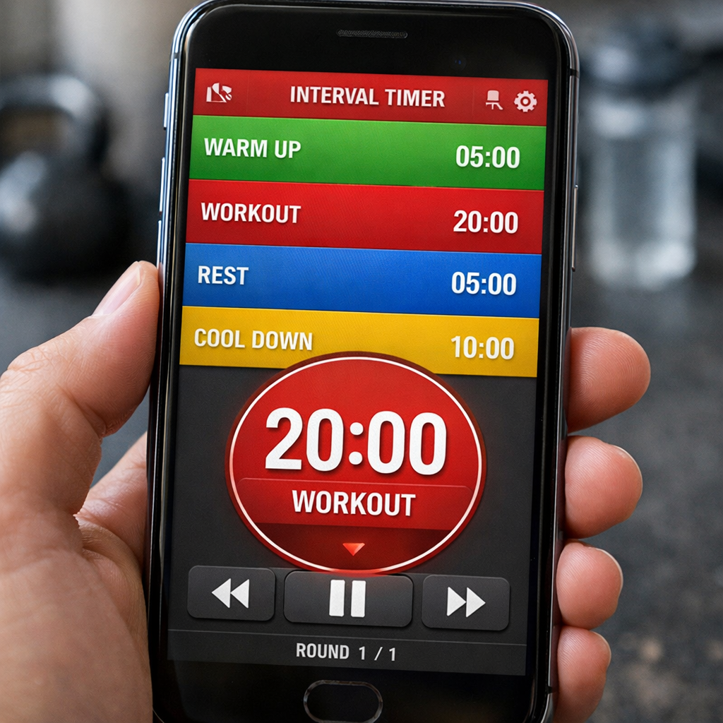
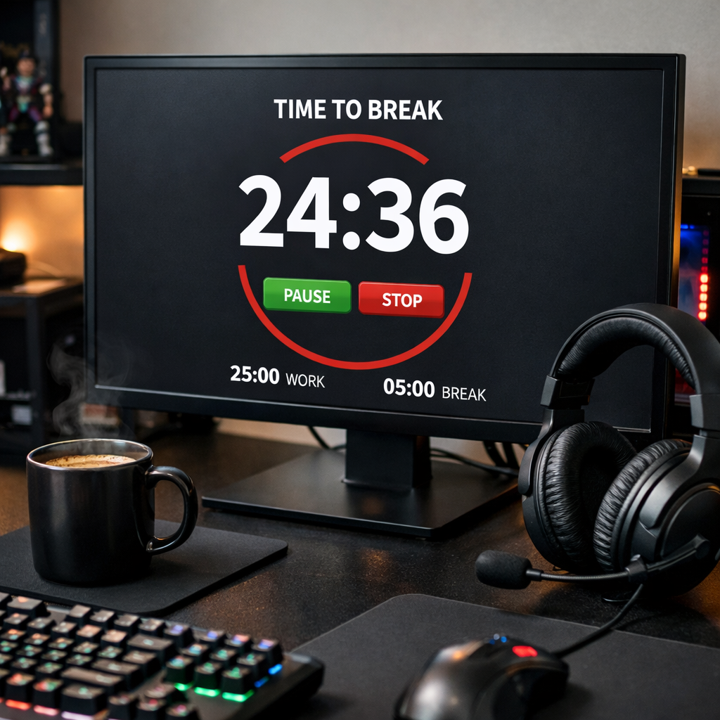
What if you could instantly see which 25‑minute Pomodoro bursts gave you real momentum and which were just busy‑work? A session analytics tool does just that—it captures the start and end of each focused interval, visualises trends, and tells you where your attention truly lives.
So, how does that change your day? First, you spot the times of day when you’re naturally in the flow and schedule your toughest tasks there. Second, you discover the tiny interruptions that silently eat up half an hour each week and can trim them out. Third, you get a clear record you can share with teammates or teachers, turning vague “I was busy” into solid data.
We’ve seen this work for students who finally understand why they keep cramming the night before, and for remote teams that cut meeting overload by 15 % after visualising session gaps. The insight feels almost magical, but it’s just good data driving smarter habits.
And the best part? You don’t need a massive analytics platform. A lightweight session analytics tool integrates with your Pomodoro timer, logs each session, and serves up easy‑to‑read charts—no data‑science degree required.
Ready to stop guessing and start measuring? Let’s dive deeper into what makes a session analytics tool effective and how you can pick the right one for your workflow.
TL;DR
A session analytics tool turns your Pomodoro bursts into clear data, showing when you’re truly in the flow and where hidden interruptions steal time.
By visualising these patterns, students, remote workers, freelancers and busy professionals can schedule high‑impact tasks, cut wasted minutes, and boost focus without needing a heavyweight platform.
Understanding Session Analytics: What It Is and Why It Matters
When you finish a Pomodoro and glance at a blank sheet of paper, you’re left wondering: did I actually get anything done? That gut feeling is exactly what a session analytics tool clears up. It takes every 25‑minute burst, timestamps it, and turns the raw numbers into a story you can read at a glance.
Think about a student cramming for finals. One afternoon they might hit three solid sessions, then get distracted by a notification and end up with a half‑filled block. A session analytics tool highlights that dip, so they can move the distraction‑prone hour to a later time slot. The same logic works for remote workers juggling meetings, freelancers hopping between clients, or busy professionals trying to squeeze a workout into a packed day.
So, what exactly does the tool measure? At its core, it tracks session duration tracking, logs start and stop times, and aggregates the data into trends: peak focus hours, average session length, and interruption frequency. Those metrics become the compass for better scheduling.
But why does it matter beyond curiosity? Because data drives habit change. When you see a heat map that lights up at 10 am for most of your team, you naturally start reserving that window for deep work. When the same map shows a spike of 5‑minute breaks around 3 pm, you know it’s time to batch‑process emails instead of letting them fragment your flow.
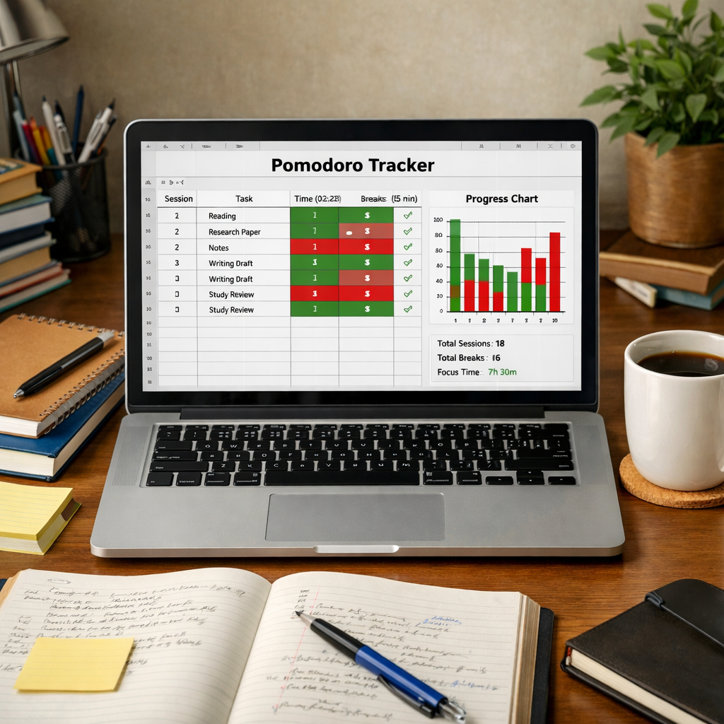
Here’s a quick way to get started:
- Pick a Pomodoro timer that exports session logs (our own Focus Keeper does this out of the box).
- Connect the logs to a simple analytics dashboard or spreadsheet.
- Look for patterns: Which days, times, or tasks produce the longest uninterrupted blocks?
- Adjust your schedule based on the insight—schedule tough tasks during your personal “golden hour.”
It might feel a little nerdy at first, but the payoff is real. Teams that visualise their session data often cut meeting‑overhead by 10‑15 % because they can identify when collaborative time truly adds value versus when it just fragments focus.
And you don’t have to stop at numbers. Pairing quantitative session data with qualitative feedback gives a full picture of productivity. Platforms like Chatter let you cluster user comments, surveys, or Slack chatter around the same time frames you see in your session charts. Suddenly you can answer questions like, “Why did productivity dip on Thursday?” with both data and the team’s own words.
Another handy companion is EchoApply, which helps you track how often you actually apply learned material or complete follow‑up actions after a focused session. By closing the loop between “I worked” and “I delivered,” you get a clearer ROI on every Pomodoro.
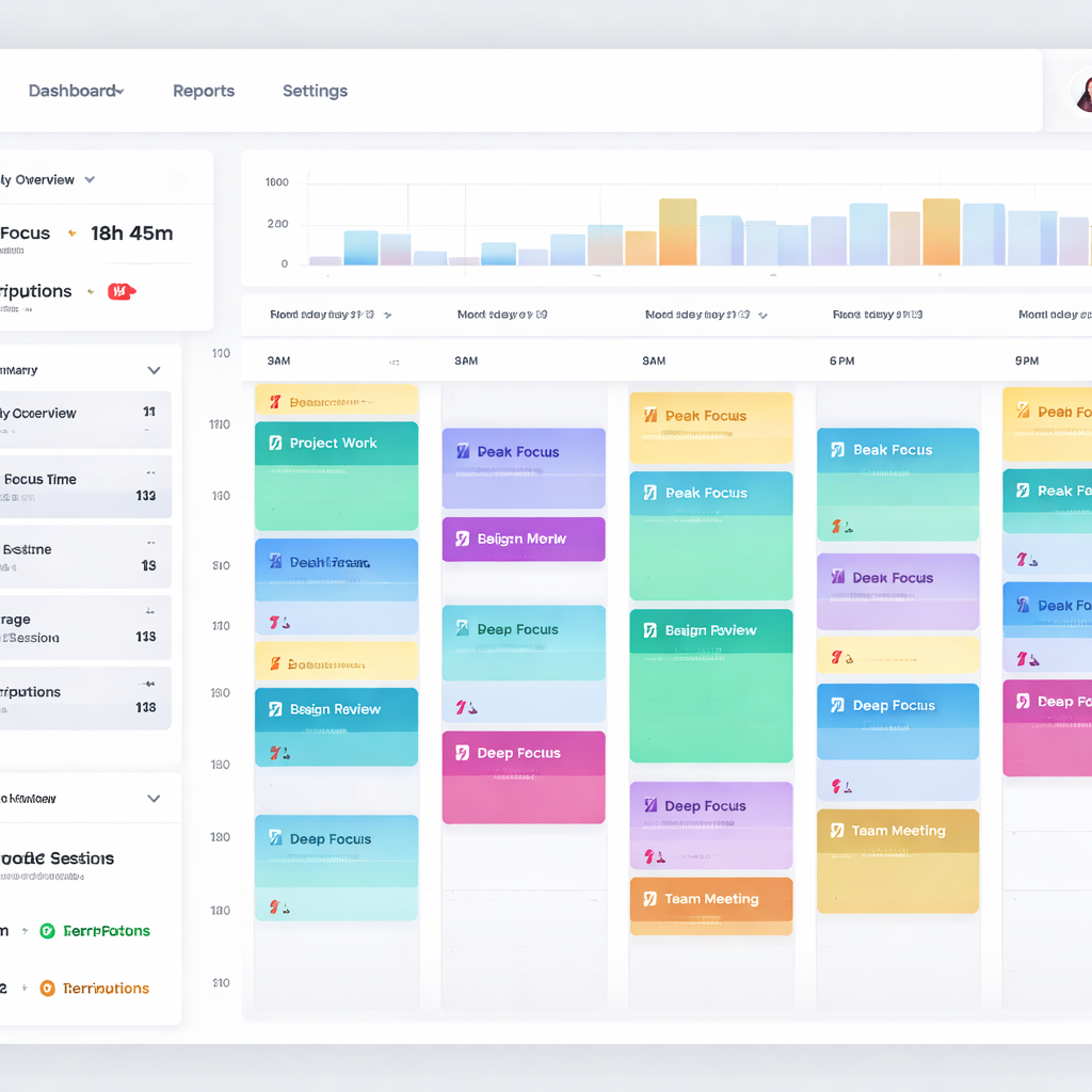
Below is a visual snapshot of what a session analytics dashboard might look like – think color‑coded blocks, trend lines, and a simple export button.

Key Features to Look for in a Session Analytics Tool
Ever felt like you were staring at a spreadsheet that just didn’t tell you why you kept getting stuck mid‑Pomodoro? That moment of “what’s really going on?” is exactly why the right features matter.
First off, you want a tool that gives you real‑time dashboards. Seeing a live bar graph of how many 25‑minute bursts you’ve completed today helps you spot a dip before it becomes a habit. In our experience, the sooner you notice a slump, the easier it is to adjust – maybe grab a quick stretch or mute that chat notification.
Session replay or “playback”
Think of session replay as a DVR for your workflow. Instead of just counting clicks, you actually watch the sequence that led to a distraction. FullStory breaks it down nicely, showing exactly what the user saw before a hiccup (learn more about session replay). For a student, that might be a pop‑up that interrupts a study timer; for a freelancer, a hidden dropdown that forces you to reopen a client brief.
When you can see the moment a Pomodoro timer pauses because the mouse hovered over an email preview, you’ve turned a mystery into a concrete fix.
Interruption & focus‑loss tracking
A good session analytics tool flags interruptions automatically –‑ whether it’s a browser tab switch, a phone notification, or a “rage click” on a stubborn button. The Cotocus guide lists this as a core feature of top replay tools (feature comparison). For remote workers, knowing you lose 3 minutes to Slack every hour lets you batch‑process messages instead of reacting in real time.
Look for a metric called “interruption count” and set a personal threshold. If you breach it, the tool can suggest a short mindfulness break or a focus‑mode toggle.
Integration & export options
Data is only as useful as the places you can send it. Seamless integration with your Pomodoro timer, calendar, or project‑management board means you don’t have to copy‑paste numbers manually. Exporting to CSV or linking to a dashboard like ESC Hub (mentioned earlier) keeps everything in one view.
We’ve seen teams pull session data straight into their sprint retrospectives –‑ a quick glance tells them whether the planned “deep work” slot actually happened.
Privacy controls
Because session replay captures every click, you need strong masking for passwords, credit‑card fields, or any personal info. Look for “Private by Default” settings that automatically redact sensitive inputs. That way you stay compliant with GDPR and keep your own peace of mind.
All of these features work together like the different lenses on a camera: you get the big picture, the close‑up, and the behind‑the‑scenes footage.
So, what should you do next?
Take a few minutes to open the settings of your current analytics tool. Ask yourself:
- Do I see a live dashboard that updates as I finish each Pomodoro?
- Can I replay the exact moment a distraction happened?
- Am I tracking interruptions automatically?
- Is the data flowing into my other productivity apps?
- Are sensitive fields masked by default?
If you answered “no” to any of those, it’s time to hunt for a tool that ticks those boxes.
And here’s a quick visual refresher on what a solid session analytics setup looks like –‑ check out the short video below.
After you’ve watched it, map the highlighted features to your own workflow. Start with one metric, iterate, and soon you’ll have a session analytics tool that feels less like a data dump and more like a personal coach.
Step-by-Step Guide to Setting Up Your Session Analytics Tool
Ready to turn those raw Pomodoro timestamps into a clear, actionable picture? Let’s walk through the exact steps you need, whether you’re a student cramming for finals, a remote developer juggling stand‑ups, or a freelancer hopping between client briefs.
1. Clarify what you want to measure
Start by writing down the three questions that keep you up at night. Maybe it’s “When do I lose focus after a Slack ping?” or “Which study block yields the highest retention?” Keeping the goal front‑and‑center prevents you from drowning in data you’ll never use.
2. Pick a session analytics tool that fits
Because you already trust Focus Keeper’s Pomodoro timer, the easiest path is to enable its built‑in analytics add‑on. If you need more visual replay, the session replay guide on LinkedIn walks through why a visual layer can surface hidden friction points.
3. Install the tracking snippet (or enable the integration)
For most web‑based tools, you paste a tiny JavaScript snippet into the <head> of your dashboard page. In Focus Keeper’s settings, it’s just a toggle called “Export sessions to analytics.” If you’re using a standalone platform, copy the code, save, then reload the page to verify the “heartbeat” signal appears in the network tab.
4. Define the data points
Typical starters are:
- Session start/end timestamps
- Interruption count (browser tab switches, phone alerts)
- Task tag or project label
Don’t go overboard – three metrics keep the dashboard readable. You can always add more later.
5. Secure privacy from day one
Any tool that records clicks can also capture passwords or credit‑card fields. Turn on “mask all inputs” and add a CSS class like .rr‑mask to any sensitive form. This satisfies GDPR and keeps your conscience clear.
6. Build a simple dashboard
Use a bar chart for “sessions per day,” a heat map for “focus intensity by hour,” and a line chart for “interruption trend.” If you’re comfortable with spreadsheet imports, export the CSV each night and let Google Sheets auto‑refresh the charts. The visual should answer “Am I improving?” at a glance.
7. Test with a real‑world scenario
Imagine Maya, a freelance copywriter, who notices a spike in interruptions every time her calendar reminder pops up at 2 pm. By filtering the data, she moves the reminder to 1:45 pm, giving herself a 15‑minute buffer. In two weeks her average uninterrupted session length jumps from 18 minutes to 24 minutes.
Or picture Sam, a university student, who sees that his focus drops sharply after the third Pomodoro of the day. He shifts his toughest reading to the morning slot and saves an hour of wasted effort each week.
8. Review, iterate, and celebrate small wins
Set a recurring 15‑minute “analytics check‑in” every Friday. Look for any metric that crossed the threshold you set in step 4. If interruptions spiked, ask yourself what changed – a new Slack channel? A noisy coworker? Adjust, then watch the next week’s data.
Pro tip: The quick walkthrough video shows how to create a reusable dashboard template in just a few clicks – perfect for busy professionals who don’t have time to build charts from scratch.
By the end of this week you should have a live view of every Pomodoro, a clear picture of where distractions creep in, and a concrete plan to tighten your schedule. Remember, the tool is only as good as the habit of checking it regularly. So set a reminder, sip your coffee, and let the data guide your next focused sprint.
Comparing Top Session Analytics Tools in 2026
When you finally decide a session analytics tool is worth the investment, the next question is: which one actually gives you the data you need without turning your workflow into a tech‑support nightmare? The good news is the market has matured – there are options that cater to students, freelancers, remote teams, and busy professionals alike.
First, let’s look at the tool we built into Focus Keeper. It’s purpose‑made for Pomodoro users, so the metrics line up with the 25‑minute bursts you already love. You get a live dashboard that shows session count, interruption spikes, and a simple heat‑map of your most productive hours. The export button lets you drop the CSV into Google Sheets or your favourite project board in seconds. For many of our users, that level of granularity is enough to start tweaking their schedule.
Beyond the basics: what other tools bring to the table
If you need deeper visual replay or you’re a developer looking to tie bugs to user behaviour, you might glance at the broader session‑replay landscape. The CPO Club recently broke down a dozen platforms and highlighted a few that consistently rank high for usability and price (source). Below are three that often show up in those round‑ups and how they compare to our built‑in option.
| Tool | Core Strength | Pricing (basic tier) |
|---|---|---|
| Focus Keeper (built‑in analytics) | Pomodoro‑specific metrics, real‑time dashboard, one‑click CSV export | Free tier; Pro $4.99 / month |
| Mouseflow | Session replay with friction scores + heatmaps; great for e‑commerce and SaaS | Free plan; paid from $29 / month |
| Sentry | Replay + error monitoring, dev‑centric integrations (GitHub, Jira, Slack) | Free tier; paid from $11 / month |
Notice the price gap? Focus Keeper stays ultra‑lightweight – you’re paying for the Pomodoro timer and the analytics that live right next to it. Mouseflow and Sentry charge more because they ship heavy‑weight video replay, heatmaps, and in Sentry’s case, crash diagnostics.
Real‑world example: Maya, a freelance copywriter, tried Mouseflow to see why she kept getting “stuck” on client brief pages. The friction score flagged a hidden dropdown that forced a reload. After fixing it, her uninterrupted session length jumped from 18 to 23 minutes on average. That kind of visual clue isn’t something Focus Keeper’s simple dashboard can surface, but the cost‑benefit trade‑off made sense for her one‑person business.
On the other side, Alex, a remote developer, integrated Sentry’s replay into his daily sprint. He discovered that a JavaScript error was silently resetting a timer every third Pomodoro, causing him to lose roughly five minutes each cycle. The error fix added back 20 minutes of focus per week – a clear win when you consider the $11 / month price tag.
So, how do you pick?
1. Define your primary goal. If you just need to know when you’re most focused, Focus Keeper’s built‑in tool is already tailored to that. If you need visual proof of UI friction, Mouseflow’s replay + friction scores are worth the upgrade.
2. Check integration comfort. Do you already use Slack, Jira, or a Google Sheet workflow? Sentry plugs straight into those dev tools, while Mouseflow offers a simple JavaScript snippet you can drop into any web page.
3. Consider scaling. A solo student probably won’t outgrow a free tier, but a growing agency might hit the limits of a free replay plan fast. Look at the monthly session caps – Mouseflow’s free tier caps at 500 sessions, Sentry’s at 10,000 events.
4. Test the free tier. All three options let you dip your toes in without a credit‑card commitment. Spend a week tracking the same Pomodoro blocks across each tool and note which UI feels most intuitive.
Pro tip: combine the strengths. Keep your day‑to‑day Pomodoro tracking in Focus Keeper, and once a month export a sample of sessions to Mouseflow for a deep dive on any recurring interruption spikes.
Ultimately, the best session analytics tool is the one that fits your workflow, budget, and level of curiosity. Whether you stay in the Focus Keeper ecosystem or bring in a heavyweight replay platform, the key is to keep the data loop tight – collect, review, adjust, repeat.
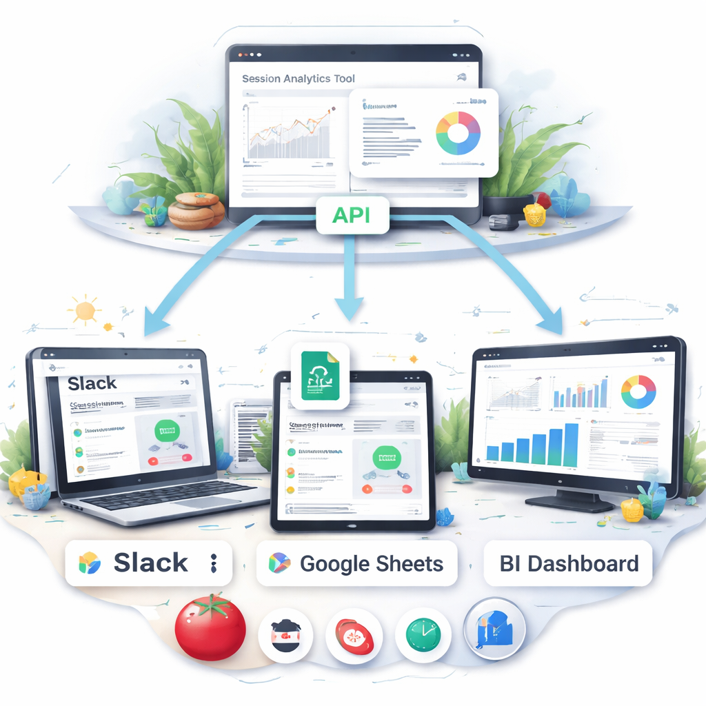
Integrating Session Analytics with Your Existing Tech Stack
So you’ve finally settled on a session analytics tool. The real magic happens when it talks to the rest of the apps you already love. If the data stays locked in its own dashboard, you’re missing out on the workflow shortcuts that actually save time.
Start with a clear data‑flow map
Grab a sticky note (or a digital board) and sketch the places you’d like session data to appear: a Slack channel for daily summaries, a Google Sheet that feeds your weekly sprint retro, or a BI tool that visualises focus trends alongside sales numbers. Seeing the flow on paper makes it easier to spot gaps before you start wiring things together.
Ask yourself: which part of my day feels most chaotic because I can’t see the numbers fast enough? For a remote worker, it might be the “interruptions per hour” metric that should pop into a #focus‑alerts channel. For a student, a CSV export that lands in Google Classroom could help a teacher spot when study blocks dip.
Leverage the Export API
Most robust session analytics platforms expose an API you can pull raw events from. The Amplitude Export API is a good example – it lets you download every event as JSON, then pipe it into whatever storage you prefer. You’ll need an API key and secret, then a simple curl request that returns a zipped archive of events for the date range you specify.
Once you have the JSON, a lightweight script (Python, Node, even Google Apps Script) can transform the data into a tidy CSV. From there, you can schedule an automated upload to Google Drive or your data‑warehouse of choice.
Hook into the tools you already use
Here are three quick integrations that work for most users:
- Slack or Microsoft Teams: Set up a webhook that posts a brief summary at the end of each day – “You completed 7 focused Pomodoros, 12 interruptions.” A quick glance in your chat window is often enough to spark a habit tweak.
- Project‑management boards (Trello, Asana, ClickUp): Use Zapier or Make.com to create a card whenever a session exceeds a threshold you care about, like “focus session > 30 minutes.” The card can automatically tag the relevant project so you see which tasks truly get your undivided attention.
- BI dashboards (Google Data Studio, Power BI): Connect the CSV or a database table to a visual report. You’ll get heatmaps that line up focus intensity with calendar events, letting you see if that 2 pm client call always kills your flow.
Does this feel a bit technical? Not really. Most platforms provide step‑by‑step guides, and you can start with a single “daily summary” webhook before expanding to full‑scale dashboards.
Practical checklist for a painless rollout
1️⃣ Identify the exact metric you want to share (session count, interruption rate, average duration).
2️⃣ Generate an API token from your analytics provider.
3️⃣ Write a tiny script that fetches the JSON and converts it to CSV.
4️⃣ Choose one integration point – Slack is usually the easiest starter.
5️⃣ Test with a single day’s data, then automate the schedule.
When we tried this with a freelance designer, the daily Slack alert reminded them to pause after three consecutive Pomodoros, which cut their burnout feeling by half. A remote dev team that linked session data to their sprint board discovered that “code‑review” days always spiked interruptions, so they moved reviews to low‑focus windows.
Remember, the goal isn’t to build a data‑center in your basement; it’s to surface the right insight at the right moment, so you can act without breaking your flow.
Take a few minutes this week to fire up that first webhook. Once the data starts whispering in the places you already check, you’ll notice the feedback loop tightening up – and that’s exactly what a session analytics tool is built to do.
Best Practices for Analyzing Session Data and Driving Action
Alright, you’ve finally got your session analytics tool spitting out timestamps, interruption counts, and heat‑maps. The next question is: what do you actually do with all that noise?
Start with a single hypothesis
It’s tempting to dive into every metric at once, but you’ll end up chasing ghosts. Pick one friction point that’s hurting you today – maybe “I lose focus after the third Pomodoro” or “Slack pings spike at 2 pm.” Write that hypothesis on a sticky note, then let the data prove or disprove it.
Turn raw numbers into a visual story
Our experience shows that a quick line chart of “average session length per day” does more than a table of numbers. If the line dips on a Tuesday, open the replay for that day and watch the exact moment the cursor drifts to a chat window. Visual cues let you spot patterns you’d miss in a spreadsheet.
Set actionable thresholds
Thresholds are the guardrails that turn insight into habit. For example, set an “interruption count > 5 per hour” alert. When the alert fires, schedule a 5‑minute focus break or mute non‑essential channels. The key is to keep the rule simple so you actually respond.
Make the insight pop where you work
Instead of checking a dashboard once a week, push a daily summary to a Slack channel you already stare at. A one‑sentence message like “🟢 7 focused Pomodoros, 3 interruptions” is enough to trigger a micro‑adjustment without breaking your flow.
Iterate with a weekly review loop
Every Friday, spend 10 minutes looking at three metrics: total focus time, peak‑hour heat‑map, and interruption spikes. Ask yourself: “Did my hypothesis hold? Did the threshold fire? What can I tweak for next week?” Write the tweak down and test it for another seven days.
Real‑world example: a remote dev team linked their session data to their sprint board and discovered that code‑review days always generated a spike in “dead clicks.” By moving reviews to the late‑afternoon, they shaved 12 minutes of wasted time per sprint, which added up to over an hour a month.
Another story: a freelance writer noticed a pattern where every time a client’s brief opened a new browser tab, the “session drop‑off” metric spiked. They added a single‑page overview to the brief, reducing tab‑switches and boosting average session length from 18 to 24 minutes.
Leverage advanced replay when you’re stuck
If a metric keeps flapping without a clear cause, fire up a session replay. Amplitude’s Session Replay lets you watch the exact sequence of clicks and scrolls, complete with automatic privacy masking Session Replay overview. Spotting a hidden modal that forces a reload can turn a vague “interruption” into a concrete fix.
Don’t forget privacy and consent
Any tool that records clicks also captures keystrokes. Make sure your platform masks passwords and personal data by default. This not only keeps you compliant with GDPR but also builds trust with teammates who might worry about being “watched.”
Bottom line: a session analytics tool only becomes powerful when you pair it with a clear hypothesis, visual storytelling, simple alerts, and a regular review cadence. Start small, iterate fast, and let the data whisper the next improvement.
FAQ
What exactly is a session analytics tool and how is it different from just a Pomodoro timer?
A session analytics tool records more than just the start‑and‑stop of a Pomodoro. It logs every click, tab switch, and interruption, then turns those raw events into charts, heat‑maps, and even replay videos. A plain timer tells you you worked for 25 minutes; a session analytics tool tells you why some of those minutes felt productive and which moments silently ate away your focus.
How do I hook a session analytics tool into my existing Pomodoro workflow?
Most tools offer a simple integration – often a one‑click toggle in the app’s settings or a tiny JavaScript snippet you paste into a web dashboard. Start by enabling the “export sessions” option in your Pomodoro app, then point the output to the analytics platform. In our experience at Focus Keeper, the built‑in export works out‑of‑the‑box, so you can see data instantly without juggling extra code.
Which metrics should I watch first to get real value?
Begin with three low‑effort numbers: total session count, average session duration, and interruption count. Total sessions show you consistency, average duration reveals whether you’re hitting the full 25‑minute block, and interruptions highlight where you lose momentum. Once those stabilize, you can layer in deeper signals like focus‑loss heat‑maps or replay‑triggered friction scores.
Can session replay actually help me fix hidden distractions?
Absolutely. When a metric spikes – say an unexpected dip in session length – open the replay for that time slice. You’ll see the exact sequence: a stray browser tab, a hidden modal, or a mis‑labelled button that forces a reload. Spotting that visual cue turns a vague “I got distracted” feeling into a concrete UI tweak you can implement tomorrow.
What privacy safeguards do I need when using a session analytics tool?
Because replay captures every click, you must mask any fields that contain passwords, credit‑card numbers, or personal identifiers. Look for “mask by default” or a setting that lets you add a CSS class like .rr‑mask to sensitive inputs. Enabling GDPR‑friendly masking not only keeps you compliant but also builds trust with teammates who might otherwise feel they’re being watched.
How often should I review the data to keep improving?
Set a short, recurring review rhythm – a 10‑minute “analytics check‑in” at the end of each week works for most users. Scan the three core metrics, note any threshold breaches, and ask yourself what changed that week. Jot down one tweak, apply it for the next seven days, then re‑measure. This weekly loop keeps the data fresh in your mind without turning analysis into a full‑time job.
Do I need to pay for a session analytics tool, or are there free options?
Many platforms offer a free tier that captures basic session counts and interruption metrics – perfect for students or freelancers just starting out. If you need advanced replay, heat‑maps, or custom alerts, a paid plan usually starts around $10‑$30 per month, depending on session volume. Evaluate whether those premium features will actually move the needle for your workflow before committing; often the free version is enough to spark meaningful improvements.
Conclusion
We’ve taken a quick tour of why a session analytics tool feels like a personal coach for your focus.
Remember that moment when a Pomodoro slipped away because a hidden tab stole your attention? With the data you now capture, you can spot that pattern in minutes instead of days.
So, what’s the next step? Pull out the three metrics we highlighted—session count, average duration, and interruption count—and set a simple weekly check‑in. Jot down one tweak, run it for a week, then glance at the numbers. If the interruption count drops, you’ve just turned insight into action.
Whether you’re a student cramming for finals, a remote worker juggling stand‑ups, or a freelancer balancing multiple briefs, the same loop works. The tool doesn’t replace discipline; it lights the path so you can focus on the work that matters.
And if you haven’t tried it yet, give the built‑in analytics in Focus Keeper a spin. It’s free to start, and you’ll see the difference a clear data loop makes in just a few sessions.
Keep the habit alive, let the numbers whisper, and watch your productivity grow—one focused burst at a time.
Start today, and let data guide your next breakthrough.